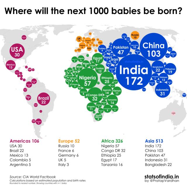
Here on Earth, ~1,000 babies will be born in the next 4.5 minutes.
Data scientist Pratap Vardhan created this data visualization showing where they will be located based on estimated population & birth rates. pratapvardhan.com #map #data
This entry was edited (3 years ago)


Andrew Feeney
in reply to Sheril Kirshenbaum • • •ራስ ባሪያው Rass Bariaw
in reply to Sheril Kirshenbaum • • •3mind
in reply to Sheril Kirshenbaum • • •Sheril Kirshenbaum
in reply to 3mind • • •Stats of India | statsofindia.in
Stats of IndiaLillyLyle/Count Melancholia
in reply to Sheril Kirshenbaum • • •Dagnabbit, Pascaline! 💥
in reply to Sheril Kirshenbaum • • •David John Crook
in reply to Sheril Kirshenbaum • • •Politically, socially, and environmentally it feels an unstable world to enter.
Sheril Kirshenbaum
in reply to David John Crook • • •DirtFarmer WithARealJob
in reply to Sheril Kirshenbaum • • •Sheril Kirshenbaum
in reply to DirtFarmer WithARealJob • • •Evey
in reply to Sheril Kirshenbaum • • •(っ◔◡◔)っ 𝑱𝑬𝑵𝑺
in reply to Sheril Kirshenbaum • • •Sheril Kirshenbaum
in reply to (っ◔◡◔)っ 𝑱𝑬𝑵𝑺 • • •(っ◔◡◔)っ 𝑱𝑬𝑵𝑺
in reply to Sheril Kirshenbaum • • •AlisonW ♿🏳️🌈♾️
in reply to Sheril Kirshenbaum • • •Jack
in reply to Sheril Kirshenbaum • • •Sheril Kirshenbaum
in reply to Sheril Kirshenbaum • • •About 109B people have lived & died. Each grain of sand represents 10M.
Several folks have asked about death rates after the previous post, so I'm resharing this incredible data visualization of human life on Earth by Max Roser from Our World in Data. /2
ptm pizza taco miercoles
in reply to Sheril Kirshenbaum • • •Zephyr
in reply to Sheril Kirshenbaum • • •Kim Spence-Jones #FBPE
in reply to Sheril Kirshenbaum • • •kernowspringer
in reply to Sheril Kirshenbaum • • •RobinBolinsson
in reply to Sheril Kirshenbaum • • •Michael Porter
in reply to Sheril Kirshenbaum • • •Longtermism: The future is vast – what does this mean for our own life?
Our World in DataJohn Francis
in reply to Sheril Kirshenbaum • • •John Dewey
in reply to Sheril Kirshenbaum • • •T1Danna
in reply to Sheril Kirshenbaum • • •