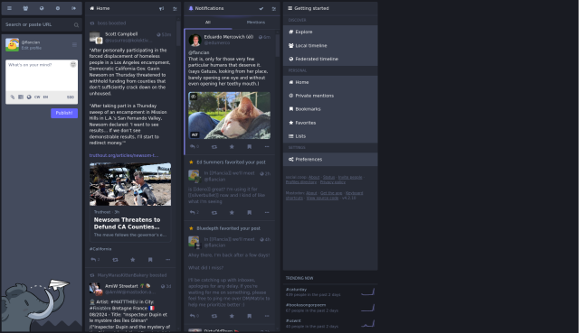
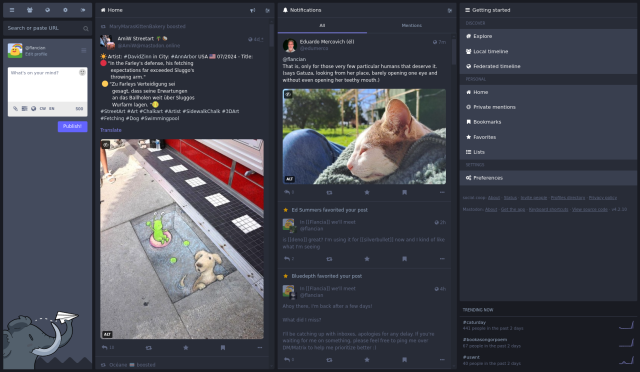
#SocialCoop I just made a simple change to the instance to make Mastodon multi-column mode "make sense" in social.coop, meaning use up all space instead of having weirdly narrow columns.
See before/after if interested, let me know if you have any issues! You can try it by enabling multi-column mode in your preferences.
h/t testman42@github.com for the workaround: github.com/mastodon/mastodon/i…
social.coop
A Fediverse instance for people interested in cooperative and collective projects. If you are interested in joining our community, please apply at https://join.social.coop/registration-form.html.Mastodon hosted on social.coop


Nathan Schneider
in reply to In #Flancia we'll meet • • •In #Flancia we'll meet
in reply to Nathan Schneider • • •Allow resizing columns · Issue #8632 · mastodon/mastodon
GitHubIn #Flancia we'll meet
in reply to Nathan Schneider • • •@ntnsndr FYI this has been reverted, please reapply the CSS manually if you still want this behavior:
div.column {
-webkit-box-flex:1;
-ms-flex-positive:1;
flex-grow:1
}
Nathan Schneider
in reply to In #Flancia we'll meet • • •Oh darn, why was it reverted?
Honestly, I'll probably just go back to the single-column interface. I am fine with that.
In #Flancia we'll meet
in reply to Nathan Schneider • • •@ntnsndr one user reported it broke their workflow, said it was too wide and it made the UI uncomfortable to read; they declined providing more details for now so I'm unsure how to work around their issue. Therefore I disabled it altogether.
Unfortunately social.coop/@flancian/11295628… is also a thing apparently.
So maybe it'll also be single-column for me. Or I'll fiddle with userscripts 😀 But most people won't, so they will miss out, which is a shame.
Nathan Schneider
in reply to In #Flancia we'll meet • • •In #Flancia we'll meet
in reply to Nathan Schneider • • •