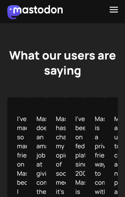
I tried to read joinmastodon.org just now, and got held up by the columnar layout. Best to avoid columns. (Also, side-scrolling is the worst!)
Not sure where to direct this, maybe @Gargron ?
#a11y
(screenshot of joinmastodon.org with heading "What our users are saying" followed by six columns of text, all truncated to about 3 characters each making it impossible to read)
Mastodon - Decentralized social media
Learn more about Mastodon, the radically different, free and open-source decentralized social media platform.joinmastodon.org

Eugen Rochko
in reply to Bob Jonkman • • •Bob Jonkman
in reply to Eugen Rochko • • •Yes, I'm using Privacy Browser from F-Droid, which has Javascript off by default.
It should be possible to get an adaptive layout using just CSS, without the Javascript dependency. Generally that means the layout won't be the same on all devices, and the content is legible for everyone.
(Sorry, I don't mean to be #Techsplaining; I'm somewhat averse to Javascript...)
Bob Jonkman
in reply to Eugen Rochko • • •Yes, I'm using Privacy Browser from F-Droid, which has Javascript off by default.
It should be possible to get an adaptive layout using just CSS, without the Javascript dependency. Generally that means the layout won't be the same on all devices, and the content is legible for everyone.
(Sorry, I don't mean to be #Techsplaining; I'm somewhat averse to Javascript...)