Search
Items tagged with: UX
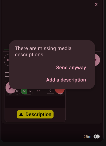
Is there any reason why the official Mastodon app (I use Android) is NOT showing a warning, if you try to post a picture without ALT-TEXT?
@apps does a great UX job here and reminds me, every time I forget to add an alt text.
If needed, I can add a feature request / bug ticket.
UX designers (which includes nearly anyone developing front-end code, whether it's in your job title or not), remember that real people will have to use your interface. It will affect them. It can have a serious impact on their quality of daily life.
Don't drive your users to this: mastodon.online/@nikitonsky/11…
#UI #UX #UIUX #UXDesign #BadUX #BadUXDesign #FrontEnd #webdev #WebDevelopment
New UX models have friction.
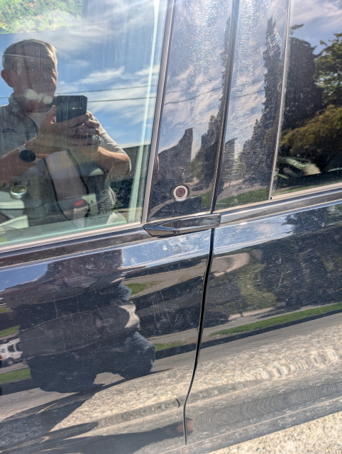
The Mach E has a push button door: push the button first, pop the door. It works once "you've read the manual" Two problems:
1. As I approached the car at Avis it was dark, I couldn't see the button at all so couldn't get it, I had to ask someone to let me in.
2. When I picked up my son at the airport, he had no idea how to open the passenger door so I had to open it from the inside.
Ford may keep this, but it's going to be a painful road. #ux
@Gargron Not by you, to my knowledge. Generally, the sentiment of replies from folks here when I mention the need for it to be easy for non-techies to join, is a reaction of fear. Like it’s best as exclusive club.
That, and a few other UX barriers to “normie” usage (e.g. easy cross-server interactions & global-ish search) still make it a hard sell to friends. #UX was mentioned as a big barrier in a “Fedi House” event at SXSW.
I can understand why it seems confusing. I guess someone would expect quote mark to quote comment text into reaction instead of sharing it.
Maybe someone here can find better icon for it for better #UX ?
#modteam the has been a lot of clear communication on the #OMN sustainability. I think the #UX tools for this are bad, this is a dev issue.
You can outreach this link to build suitability opencollective.com/open-media-…

Open-Media-Network - Open Collective
OMN is a project to reboot the original #openweb as a useful tool for progressive social change and challengeopencollective.com
At the #OMN Our 5 instances were funded by the remaining 5k of the tech fund from visionontv project grant for the last ten years, this pot of money is now beyond empty. It was never self funded... opencollective.com/open-media-… This is normal issue... Have been applying for #FOSS Dev funding for #OMN last 3-4 years to cross fund the instances but nothing, #blocking, as most of this funding is poured down the drain.
The instances have been running to seed the #OMN tech Dev and provide hands on #ux and backend mod knowledge for these Dev projects.
The is nothing happening to fix this #FOSS mess, only the #fashionista stuff is sustainable and this soon disappears when it goes out of fashion.
#openweb reboot is limited by the people working on it. We obviously need to do better and we can if we choose too #OMN

Open-Media-Network - Open Collective
OMN is a project to reboot the original #openweb as a useful tool for progressive social change and challengeopencollective.com
This mosaic layout looks really interesting!
I'm personally on a dynamic tiler, and I really like it (with 9 virtual workspaces), but it indeed looks weird sometimes to see like a control panel with two sliders take up the whole screen. I just personally don't care that it's ugly for that 20 seconds I need to use 😂
But FWIW, a new API through which an app can communicate what size it would feel comfortable being in seems promising.
@bob
This mess you talk about is not solved by more tech we already have most of what we need.
* Open media is #4opens based on trust, the current ActivertyPub is a relatively #KISS good example of this.
* Privacy is encrypted p2p chat, which the are meany good #UX mature #FOSS projects you can find
The change we need is social, getting people to use the different approaches for different needs, this is surprisingly difficult.
Bridges while dangerous are needed.
#TIL about the Join Jabber collective:
Their aim is to make the federation of chat servers using the XMPP protocol accessible to more people, and improve #UX across the whole network.
#chat #federation #jabber #XMPP
Collective goals
When we founded our collective, we gave ourselves a set of goals. On this page, you will find the updated list of our goals, refined over time. These goals were debated in English language during our meetings, and contributions are welcome.JoinJabber
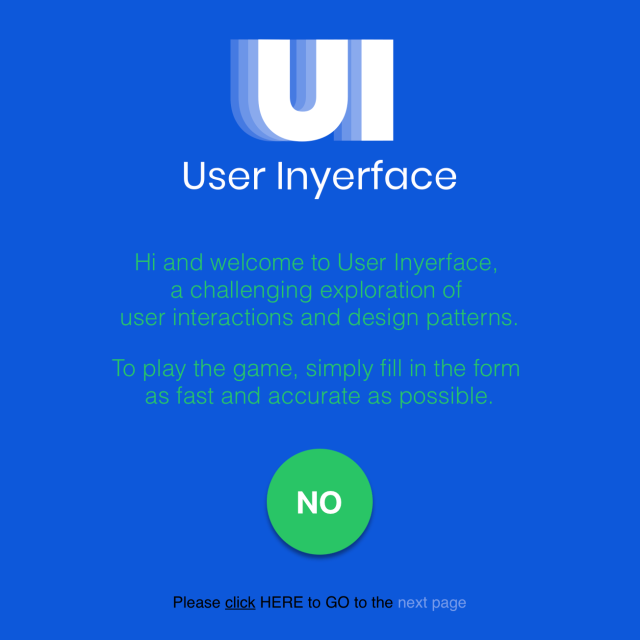
Check out this best worst thing I found. It is my UX nightmare but also fun to play.
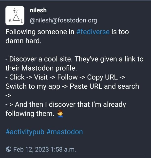
This type of #Fediverse user-experience (#UX) problem could be solved in different ways.
fosstodon.org/@nilesh/10985117…
nilesh (@nilesh@fosstodon.org)
Following someone in #fediverse is too damn hard. - Discover a cool site. They've given a link to their Mastodon profile.Fosstodon


