Search

Items tagged with: ui


UX designers (which includes nearly anyone developing front-end code, whether it's in your job title or not), remember that real people will have to use your interface. It will affect them. It can have a serious impact on their quality of daily life.

Don't drive your users to this: mastodon.online/@nikitonsky/11โ€ฆ

#UI #UX #UIUX #UXDesign #BadUX #BadUXDesign #FrontEnd #webdev #WebDevelopment


!Friendica Support

Learning question and a call for action:
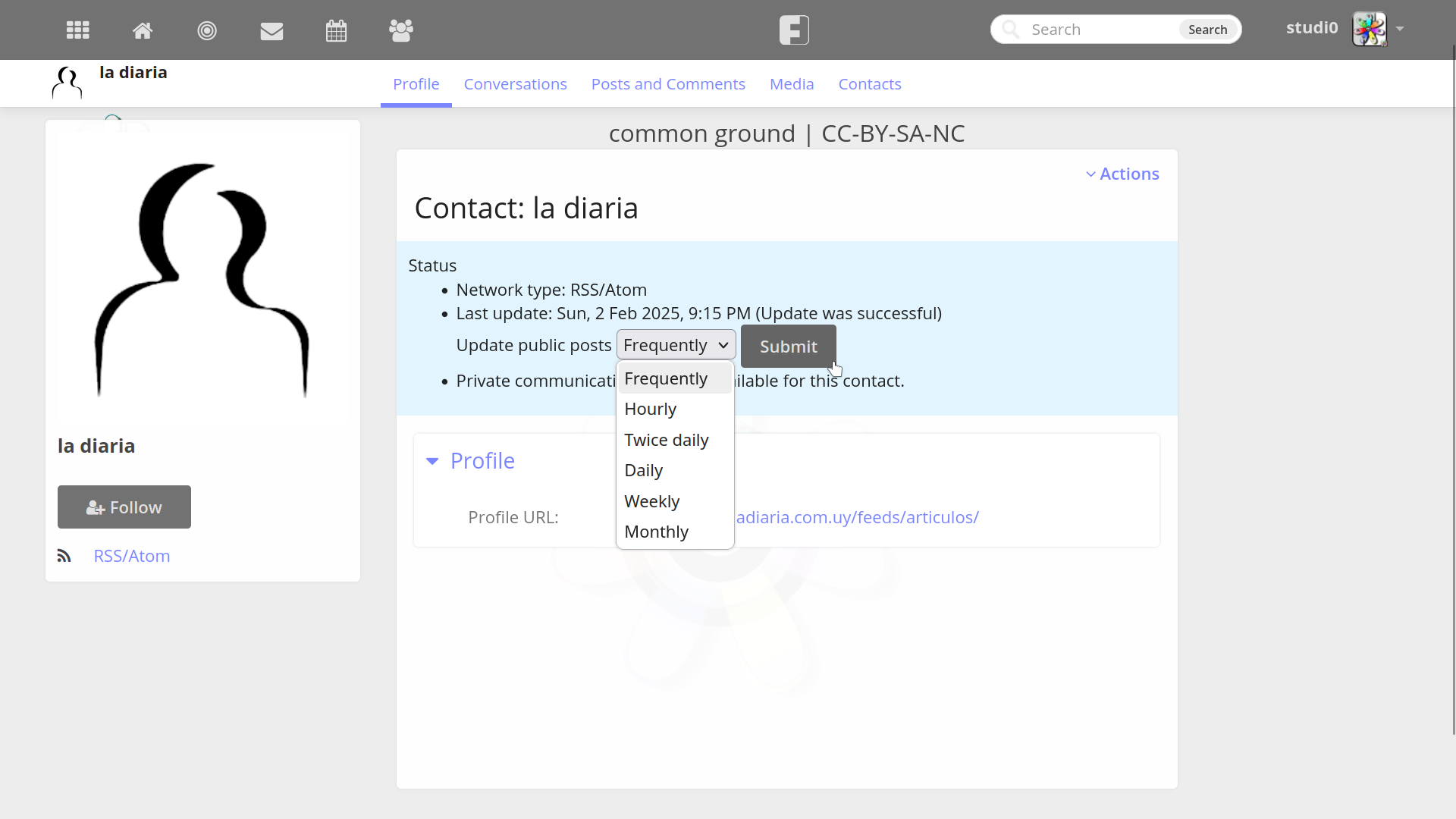
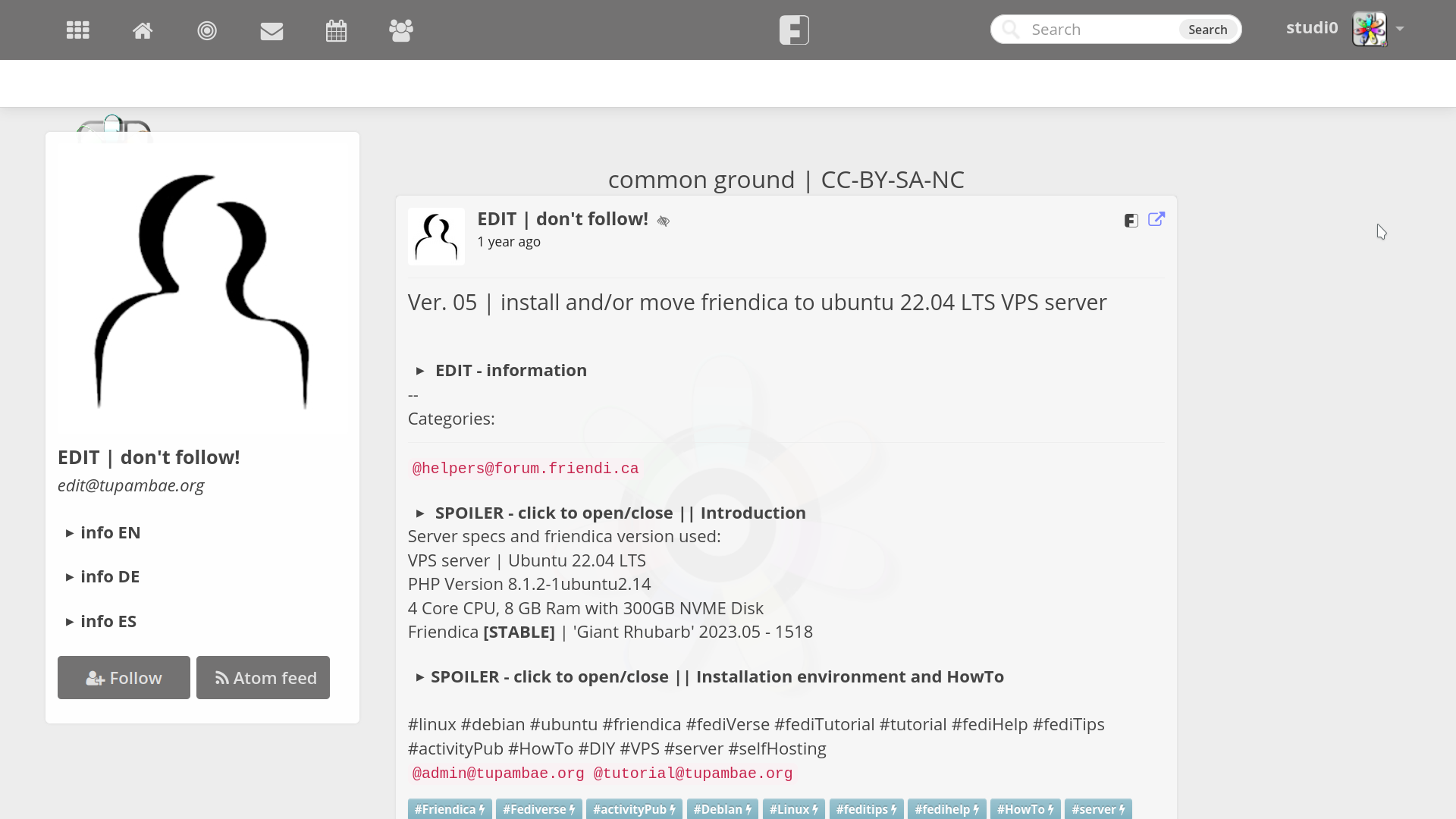
Why do people say that the #friendica user interface #UI as seen from a standard laptop desktop, in other words a working station screen, isn't a pleasant experience?

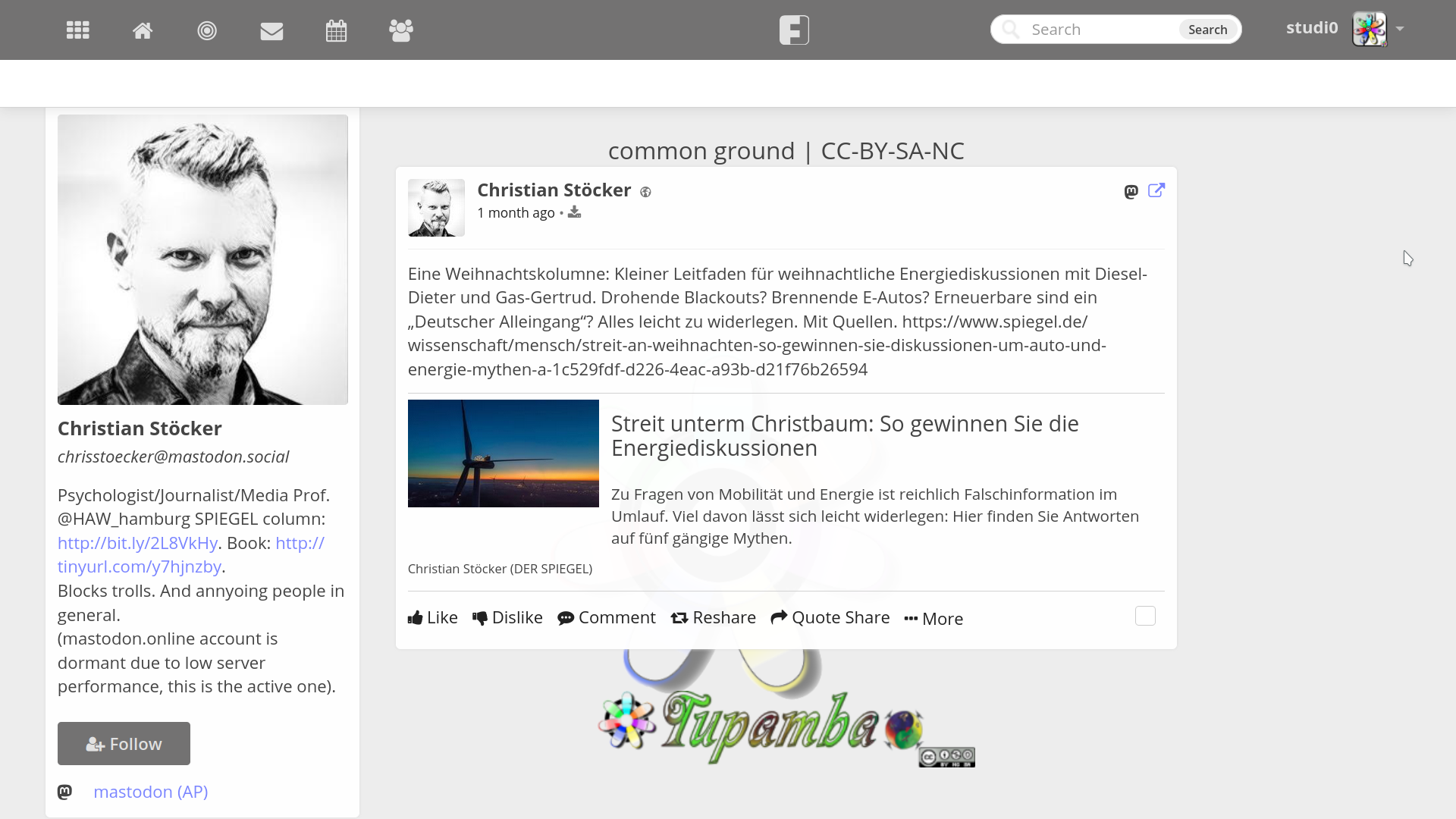
This looks like serious stuff to me, like a #newsPaper outlet similiar to #NYtimes or #ZEIT.

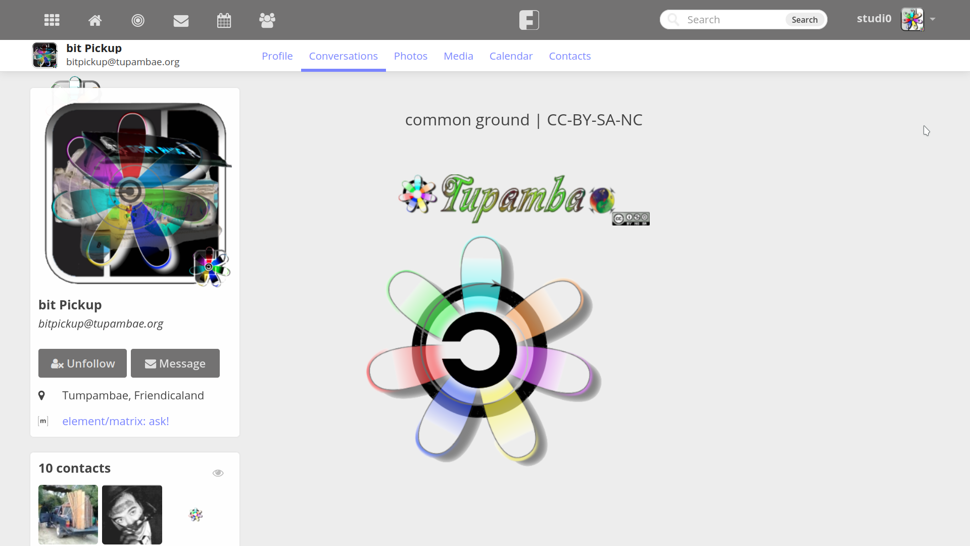
  • The page background, seen here on this server as a big center #copyLeftFleur is modifiable.
  • The logo kind footer as weel.
  • A simple text field for the main header of the page, like in this case [common ground | CC-BY-SA-NC] fits nicely.

Can somebody please #enshittify this #KISS a littel bit, wasting time, attention and selfconfidence of the coder community!


@Jeff Jarvis @Eva Wolfangel @Christian Stรถcker @taz @taz @Digitalcourage @Cory Doctorow


Jump, jump, jump! Everybody loves content layout shift.

Really, @Gargron just happily releases this and nobody checks if it works? What happened to using multiple browsers to test? What happened to using CSS that works?
#css #mastodon #mastoadmin #html #ui #ux #bug


This mosaic layout looks really interesting!

I'm personally on a dynamic tiler, and I really like it (with 9 virtual workspaces), but it indeed looks weird sometimes to see like a control panel with two sliders take up the whole screen. I just personally don't care that it's ugly for that 20 seconds I need to use ๐Ÿ˜‚

But FWIW, a new API through which an app can communicate what size it would feel comfortable being in seems promising.

#Linux #GUI #UX #UI

#linux #UX #ui #GUI


Both look fine too me.

I will admit though that the new one looks less like a bird and the envelope being pushed to the back is making it less clear that its an envelope.

The old one is classier and has more personality.

Boils down to what you're going for I guess. Personally I've rarely used #Thunderbird since I consider it cluttered and messy similar to #outlook

If Thunderbird's #UI would follow the changes of their #logo I'd be a #happycamper


Hi everyone! I'm Adlan & I'm a UI Technical Designer at a AAA studio by day & a solo gamedev/artist by night!

Looking forward to meet new people & make more meaningful connections here. I hope this platform works better for artists & gamedevs compared to that bird platform ๐Ÿ˜†

Here's a showcase of my previous & current games! (These are all GIFs in case they don't autoplay here ๐Ÿ˜…)

#introduction #gamedev #indiedev #indiegame #ui #design #art #artist #mastoart

Lo, thar be cookies on this site to keep track of your login. By clicking 'okay', you are CONSENTING to this.

โ‡ง